
In a recent eDiscoveryToday article, a statistic caught my attention: The human brain “processes images 60,000 times faster than text, and 90% of the information transmitted to the brain is visual.” The implication was that “data visualisation is an effective way to enhance attorney insights and decision-making in eDiscovery.”
This inspired me to write a blog post that connects key features built into Proofpoint Discover to the way the human brain works. Here, I’ll detail three unique data visualisations that help our clients speed up time to e-discovery insights and more.
1: Uncovering communication patterns with the “Network with List” view
To better illustrate the value of our data visualisation features, let’s look at the e-discovery example below.
In my demo archive sandbox, I’ve archived 377,448 items across various source data types, from email to collaboration platforms to social media. If I search across the entire archive for anything that contains the words ‘confidential, sensitive, proprietary or internal’, I get in return 3,684 pages with over 55,259 results, as shown below.
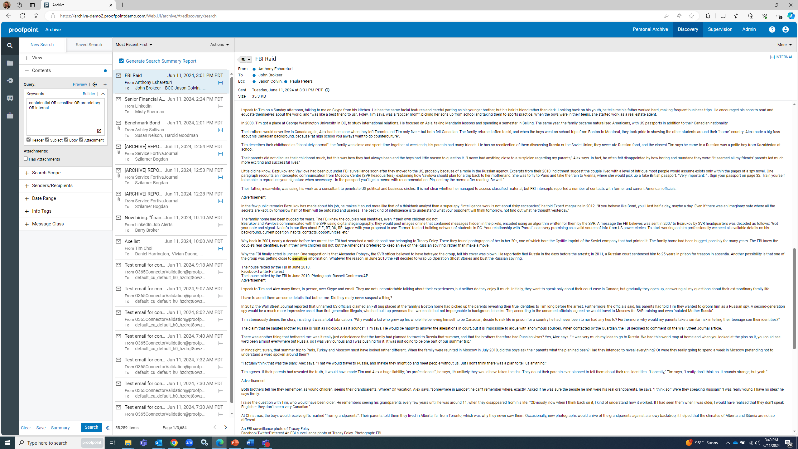
The Proofpoint Archive search feature, showing results.
I could manually review this simple list of 55,259 results for relevancy (!). Or I could use data visualisations to speed up how I uncover patterns, items of interest and other insights.
Let’s change how I view the results from “List” to “Network with List.” That immediately sheds new light on communication patterns that could warrant further investigation. And there’s no waiting to process or generate reports. This is simply a change in how to view the results, and it happens instantly.
The Network with List view highlights top senders by activity within the search results, as shown below. Note that you can scroll your mouse over different top senders to identify their unique connections. You’ll also see senders that are potentially not relevant, which you can easily exclude from the results.
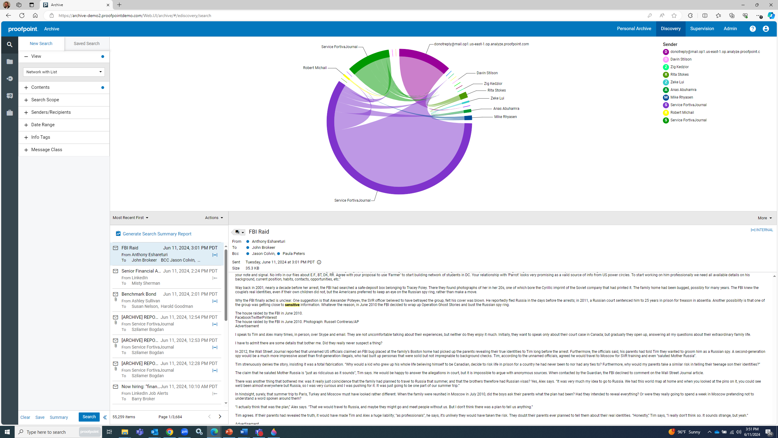
The Proofpoint Archive data visualisation feature helps uncover patterns.
2: Identifying communication spikes with the “Timeline with List” view
The Timeline with List view is another data visualisation. But instead of examining communication connections as we did with the Network with List view, we’re exposing bursts of communication that happen over a given period.
These so-called “spikes” could be another set of communication patterns that warrant further investigation. Similarly, if you have no data for a potentially relevant date or series of dates, then you could address that early in your investigation.
Using our same e-discovery example, let’s change the view from “Network with List” to “Timeline with List.” Like before, this happens instantly, because we’re just changing how to view search results. No additional processing is required.
In the screenshot below, you can see that the visual changes from a network pie chart to a timeline bar chart, illustrating the volume of messages per year from the search results.
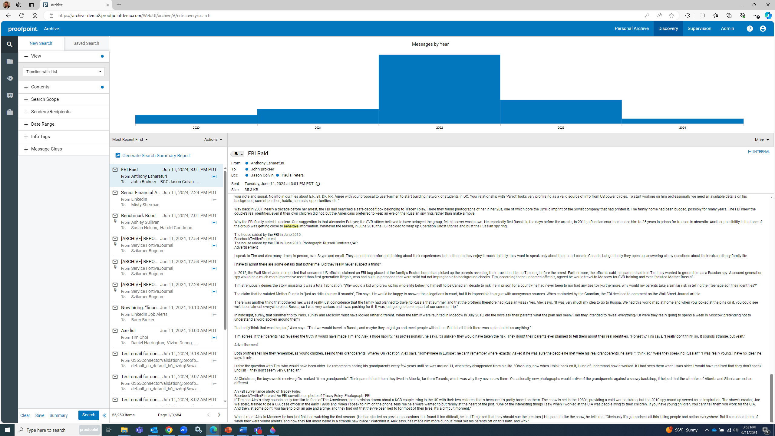
Proofpoint Archive uses a “Timeline with List” view to uncover communication spikes.
In our example, the year 2022 appears to have the most archived messages of potential interest. To investigate that further, you can click on the 2022 segment of the bar chart, which shifts the chart to a more granular view of search results per month in 2022.
The results show that October was the most active month in 2022 in terms of volume of messages. Click on the October segment of the bar chart, and the graphic shifts to a new chart that displays activity in days over the course of October 2022, as shown below.
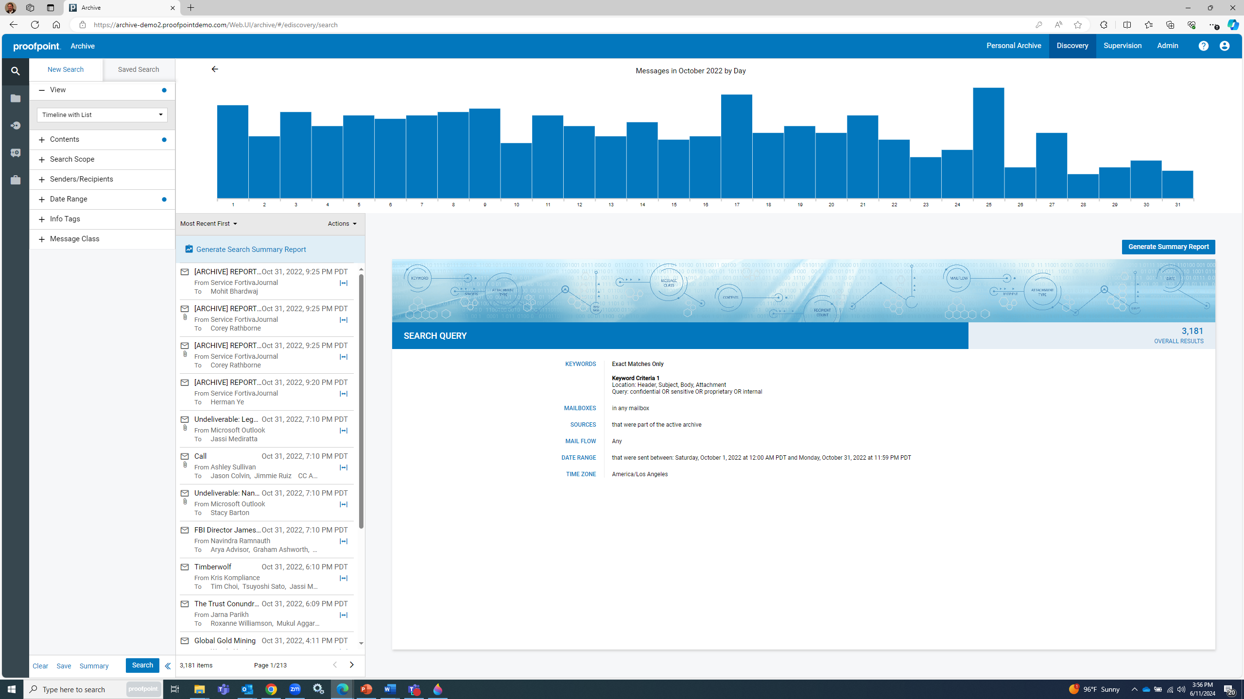
Clicking on the bar chart in Proofpoint Archive provides a more granular view of results.
You may not realize it, but you’re filtering data with this exercise. You’ve gone from 55,259 items in your original search to 3,181 items (in October 2022) to only 123 items if you click on October 25, 2022, which appears to have the biggest volume of messages in the month.
This filtering happens instantly as you change how to view your search results. And while the exercise in real life may not end with finding the desired “needle in a haystack,” at least you know that with Proofpoint you can assess different “haystacks” of search results for relevant information instantly, without having to manually add new filters or rerun searches.
3: Uncovering “what ifs” for search criteria with Query Analytics
Have you ever been asked to rerun searches to better understand the impact of removing search criteria from your query? But you’ve also been afraid to do that because it took you so long to get the search results you already had?
Long sentences and long search times aside, I suspect a few of you may have begrudgingly rerun searches at the behest of friends in the legal department. With Proofpoint, you no longer have to fear these requests.
With our Query Analytics feature, you can generate an impact report within seconds when you run a search. The report is in a PDF format, so it is easy to view—or even download as proof that your results are unequivocally derived from the criteria specified. The report shows how your results will change if you remove specific criteria.
In our ongoing example, remember how our initial search for anything with the words “confidential, sensitive, proprietary or internal” yielded 55,259 items? In the respective Query Analytics report, as shown below, if you remove the term “internal” from the query, the results are reduced by 40,725 items. It also shows other useful information like the number of times the search criteria showed up in Info Tags (as defined by the administrator) and Message Classes (data source type such as email). You get all these insights in seconds, without having to rerun searches.
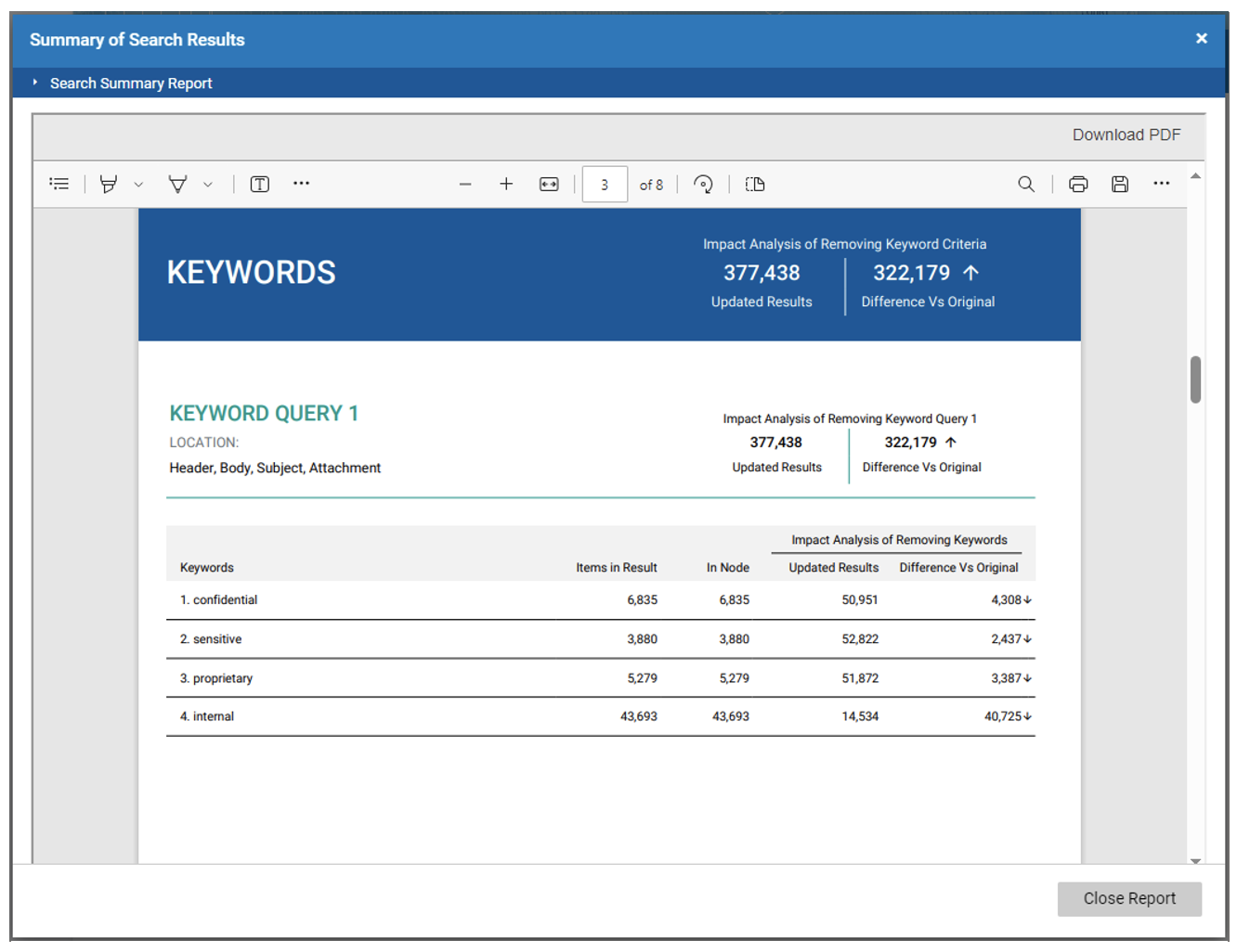
The Query Analytics feature from Proofpoint, which can generate an impact report in seconds.
Learn more about Proofpoint Discover
Discover is part of our Intelligent Compliance portfolio, which also includes:
- Proofpoint Capture
- Proofpoint Patrol
- Proofpoint Track
- Proofpoint Archive
- Proofpoint Supervision
- Proofpoint Automate
In addition to the data visualisation features highlighted in this blog, Discover includes popular features like Case Management and Technology Assisted Review (TAR).
To learn more, visit the Proofpoint Discover page or schedule a complimentary demo.
